11/24/08

Assignment #6: Newsletters

Compare and contrast the examples of printed newsletters in Publication Design Workbook to the email/HTML newsletters at the links provided (www.davidwolske.blogspot.com):
  • What similarities do the different formats share? What visual clues indicate the serial nature of the publications?
Each of the different formats aim to achieve the same means: they are meant to give information in a logical and ordered way about a subject. In sharing that, they are all very text based,  but they are laid out with space to allow the reader to breathe, and they are all very geometrically organized. There is an apparent grid, ordering information into a logical hierarchy that allows the reader to skim over the pages, find the information he or she desires, and focus on that information easily. 

All of the formats also share the idea of imagery that is directly applicable to the information presented. This further allows the reader to easily locate information he or she may be most interested in.
Another similarity unites all of the publications by means of their differences. Each publication has a very particular identity that they hold true to throughout the project. There are conventions that each of the publications follow to remain easily recognizable as different from other publications.
  • What are the major differences? How does the format limit the presentation of the content?
The major differences come from the nature of where the publication actually exists. 
Most of the internet publications rely on skinny, long layouts, with more recent or more important information at the top and older or less important information closer to the bottom. This established hierarchy. The printed publications establish hierarchy with different sections and then again, within each section by means of captions and pullouts. 

Although white space on web pages is much cheaper than paper, the web publications all seem to squeeze information down into less space. This is likely because the computer screen is not as friendly a space to read information, so designers spread the information out less to ease confusion associated with website navigation.

  • Of the printed newsletters shown in PDW, which layouts do you think would readily translate into an email newsletter? Why?
Without a doubt the newsletter that would most easily translate into and email newsletter is that ASKO Schonberg newsletter. The lack of complex hierarchy would make it very easy to translate into an email newsletter, and very easy for the reader to navigate, read, and comprehend. 

The Rund Herum newsletter comes in a close second, for the same reasons. Also, it is printed in subdued colors that would be easier on the eyes for reading on-screen.

  • Fontshop and Emigre publish digital newsletters as well as more traditional printed newsletter style promotions? Why?
Fontshop and Emigre are both digital type foundries. Their typefaces are used on-screen as well as in print. Therefore, it is important to reach the greatest number of people in all disciplines of design, and it is important to display the typefaces in applicable settings. 

The digital newsletter reaches many people, and it does so for virtually free, with few limitations on colors or effects. The low cost and freedom of media that remains on-screen are good ways to grab attention.

The printed promotions show the typefaces in another context. The newsletters themselves can become objects that designers will keep for their design value. The printed newsletters also show what the typefaces Emigre and Fontshop promote actually look like on paper. 

11/8/08

Assignment #5: Influential Magazine Designer

Research a magazine designer or art director that was active between 1930-1960 and post a short bio. In addition, discuss what made their work groundbreaking and influential. Include images of magazine covers or designs

Think about what Pentagram designer Luke Hayman said in the short interview we watched in class on Wednesday. He said: "I'm a big fan of copying, but not copying directly from your peer." Hayman encourages researching the design archives. He specifically mentions the internet, but what other design archives are available to you? 


Otto Storch (1913-1999)

Otto graduated from Pratt institute and started working as a photo editor for Dell Publishing. He was not satisfied with his job, and took night classes with Alexy Brodovich, the art director for Harper's Bazaar. He was eventually offered a job as assistant director to Better Living, a magazine published by the McCall Corporation. He moved up in the ranks of the company until he was given full creative responsibilities for McCall's magazine. He was the art director for 14 years, starting in 1955.

Steven Heller of the of the New York Times wrote:

"In the late 1950's Mr. Storch was one of a handful of graphic designers who helped transform and modernize the visual content of American magazines. He belonged to what the graphic design historian Philip Meggs calls the New York School, a group of editorial and advertising designers who based layouts on unified visual ideas rather than merely embellishing the page with ornamentation."

Here are some examples of layouts by Otto Storch:


Design influences can be found all over. Archives are available at any book store or public library. Beyond that, taking a walk downtown can yield ideas and inspiration you might not obtain anywhere else. 


9/22/08

Assignment #4: Typeface Choices in Book Design

Find a book that is the same format as the series you are designing, or very close (5 x 8), and contains a similar style of content - a biography, for example. Tell us the title, author, publisher, publication date and ISBN. Analyze the typography and address the following questions in your blog post. Use images to illustrate your findings.


I chose Oscar Wilde's The Picture of Dorian Gray, written in 1890 and revised in 1891.  The book is a portrait orientation that measures 4 7/8 x 7 7/8.   The publisher is Oxford University Press, published originally in  2006. It's a sort of biography, however the character is fictional. The ISBN is 978-0-19-280729-8


Below are some type samples. The first compares a scan of the text in the book to Ehrhardt by Linotype, and the second is a paragraph scanned out of the book.


  • Typeface - what is the typeface and why do you think it was chosen? Is it appropriate?
The typeface is Ehrhardt, offered for sale by Linotype online. I can't find any sort of connections between the typeface selection and origin, publication date, or historical precedents. The typeface does, however, support for many languages and applications, with 629 characters. It is slightly condensed when compared to other serif faces, which helps to conserve space. Being a serif face, it is easier to read for extended periods of time. There are 4 fonts: Roman, Roman Italic, Semibold and Semibold Italic - which is enough variation for the purpose of a book.

  • Type size - using the scale on page 36 in Publication Design Workbook, give an educated estimate of the size of the type used.
The type size is about 10 pt.

  • Interline space, or leading - looking at page 39 in Publication Design Workbook, which example most closely resembles the text setting of the book you are examining?
The leading most resembles a medium ground between example C and D. The type is set as something close to 10/12.5

  • Indent - if the paragraphs are articulated using an indent, how deep does it appear to be? is there a relationship to the size of the type or the leading?
The indent is approximately an em. That would be a 10 pt. em, creating a relationship between the indent and the type size.

  • Line length - how many words per line, on average? Is is comfortable to read?
There are about 10-12 words per line on average, and 45-55 letters per line. It is plenty comfortable to read.


Now, compare the book series you are designing. How do your design decisions compare?

My book is set in 10/14.1 Baskerville. the decision to use Baskerville is the same - the readability of the serif face - however Baskerville is not as condensed to save space, and I chose to lead out my type to read easier. My indent is 1.125 in., much more than a single em (about 1/8 in, which I think helps to distinguish the paragraphs better, however I may re-consider such a drastic indent. My book series boasts about 10 words and 45 characters per line, which reads similar to this Oscar Wilde book.


9/15/08

Assignment #3: Grids

Most of the examples we saw during your book series presentations used a single-column grid, also called a block or manuscript grid. Discuss at least 2 other kinds of grids, show visual samples, and use vocabulary that describes the specific, anatomical features that make up a grid.

When working with layouts, grids can be an easy way to effectively establish order on a page when arranging type and imagery. Grids are made up of horizontal and vertical lines that establish a skeleton on the page; a framework that the designer can use to his or her advantage, or break if he or she chooses. 

Here is a picture of what is called a modular grid and some information taken from Layout Workbook by Kristen Cullen that illustrates all the different parts of grid systems:


1. Flowlines - support vertical columns by dividing the page into horizontal intervals to provide additional alignment point throughout the grid. they help the designer consistently position the visual elements as they rise or fall along the column edges. 

2. Margins - define the active area of the page and direct the viewer toward the visual elements. they may vary in size depending on the format, as well as the type and quantity of content. The margin space may also be used for the placement of subordinate elements such as folios and footers. 

3. Column Intervals - also known as gutter widths, are inactive, negative spaces that separate one comlumn from the next and prevent textual and visual elements from colliding into each other.

4. Columns - are vertical divisions of space that are used to align the visual elements. Single or multiple columns may divide the page, depending on the quantity and complexity of information included. Column widths may also vary according to the function of the design, as well as the level of flexibility required by the designer. 

5. Grid Modules - are spatial areas that support the textual and visual content of the design. Depending on the quantity of the visual elements, the number of active modules may vary from one design to the next. 


When you start looking, grid systems become apparent in many designs. 

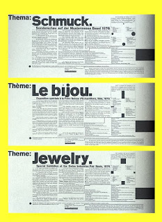
Here is an example of a poster done by Wolfgang Weingart for a special exhibition at the Mustermesse Basel, Jewelry 1976:


When we draw in the apparent flowlines, columns and margins, we can see a design well-organized around a multi-column grid:


With this grid, the most important lines are those defining the columns, although we can see some flowlines that create grid modules as well. 

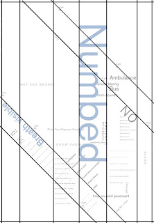
Although most grids are based on horizontal and vertical lines, alternative grids are sometimes developed that create interesting, but organized compositions in all directions, such as this work by Patrick Crawford:


If we draw some lines, we can see that even this layout follows a gridded structure:


And there you have it, the basics of the grid, and some ways to apply it. 

9/5/08

Assignment #2 Part 2

Select a book (any genre) whose format appeals to you. Tell us, your faithful readers, what the format of the book is, post a picture of the cover, and hyperlink the image to where we can purchase the book online, because we will surely run right out and do so.

I like my art books.

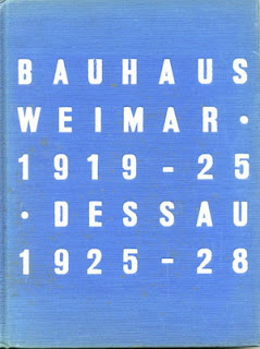
I recently got a book from a friend of mine, called bauhaus 1919 - 1928 (lower case on purpose obviously). It was edited by Herbert Bayer, Ise Gropius, and Walter Gropius. It was first published in 1938, and my copy, the third printing, was published in 1959, in hardback. 

The pages of the book are 7.5 x 10 inches, which is a 3:4 ratio. Interesting, because this is a ratio that is commonly used for painting canvases. It works well as a compact book, with still enough space to create layouts that breathe and contain a substantial amount of information.

It's based on Bauhaus practices. After the chronology of the book passes 1925, the rest of the book is set without capital letters, in accordance with the Bauhaus typographic practices introduced then. There is a very apparent grid that is played with throughout the book. In the end, who better to tell the story of the Bauhaus than those that were directly involved. 

I couldn't get a picture of the outside sleeve, but here is a rather bad picture of the hardcover of my edition:


You can purchase the book on Amazon.com, here.


9/2/08

Publication Design

Publication, as defined by the Webster's Revised Unabridged Dictionary:

1. The act of publishing or making known, notification to the people at large, either by words, writing or printing; proclamation; divulgation; promulgation... more big words...

2. The act of offering a book, pamphlet, engraving, etc. to the public by sale or gratuitous distribution

3. That which is published or made known, especially any book, pamphlet, etc., offered for sale or to public notice...

4. An act done in public


Design, as defined by the Webster's Revised Unabridged Dictionary (applicable entry):

3. To create or produce, as a work of art; to form a plan or scheme of; to form an idea; to invent; to project; to lay out in the mind; as, a man designs an essay, a poem, a statue, or a cathedral. 


Thereby combining those two, "Publication Design" is the creation of a publication in one of it's many forms. 


I have chosen to share a portfolio website, that of illustrator Si Scott:


The site is simple, wide open, easy to navigate, straight to the point, and nicely laid out. The flash menus add interest without being confusing or too fancy. The typography is classy. 

However, the best part about it is that it's so simple that the work - which is the point of the website - is really displayed without being taken away from by any other flashy graphics. That is perhaps the number one merit of a text based portfolio site.

Check out this video of Si: